
The Can That Said Too Much: Pop Art Beer Design Glitch
11 May 2025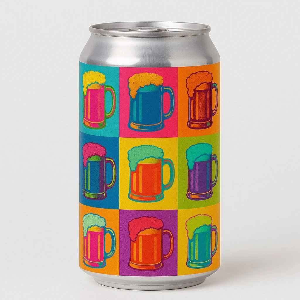
One Word, One Wall
It started with one word during a ChatGPT design session. Boom! A comic-style burst surrounded by strawberries, citrus, and cherries. Pure Pop Art energy. Perfect for a sour. But when I tried placing it on a can, the system blocked it.
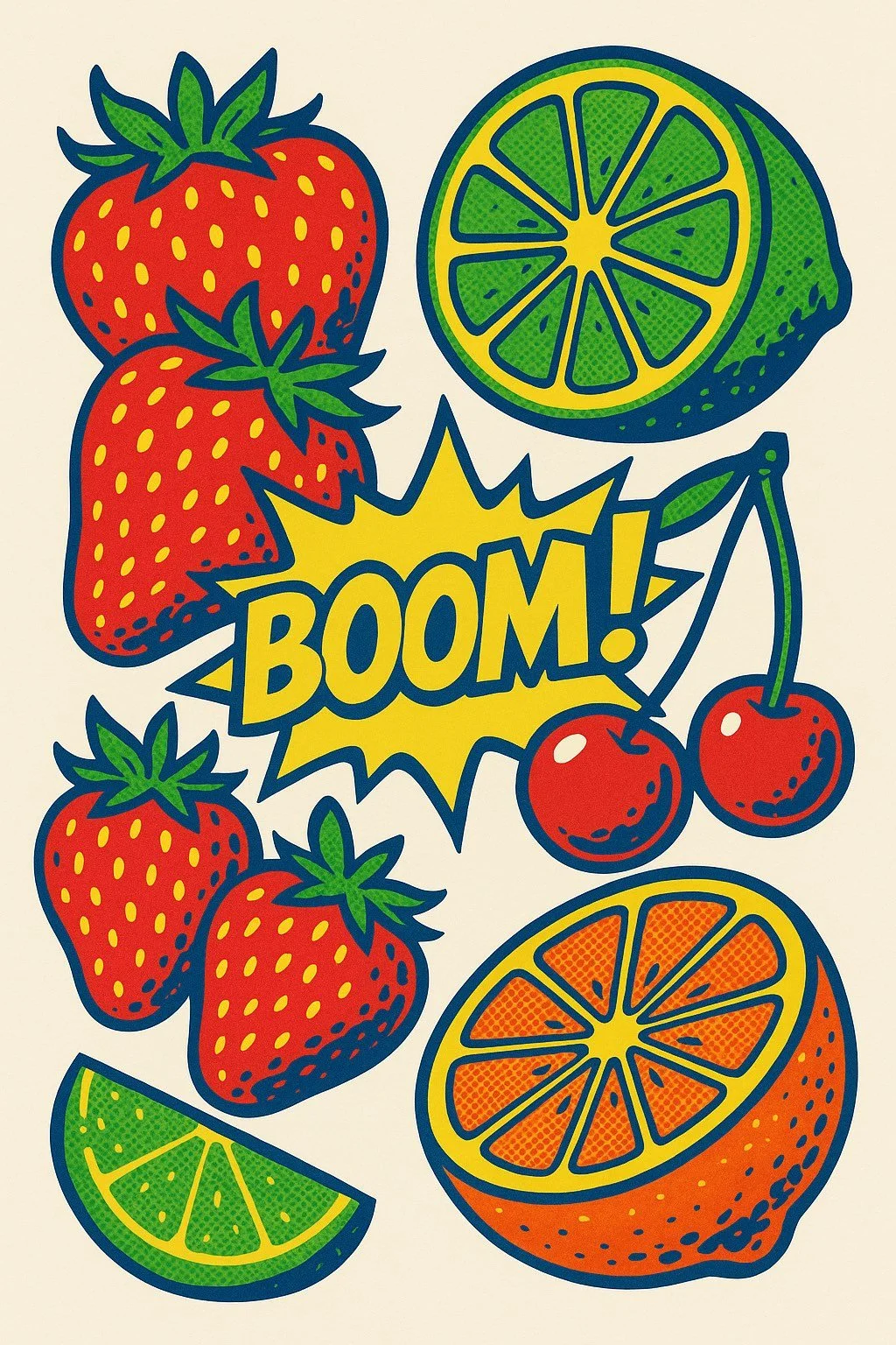
The Boom poster that started it all.
Apparently, it looked too much like real advertising. Bold text on packaging triggers content filters. I pivoted, removed the word and turned it into a poster. Visually, it worked. But when I brought the artwork back to the can, it had a weird void where Boom used to be.
I asked to fill the gap with cherries. That opened a new glitch. Cherries started appearing in unrelated designs. Like a design ghost that wouldn’t leave.


A Shift in Rhythm
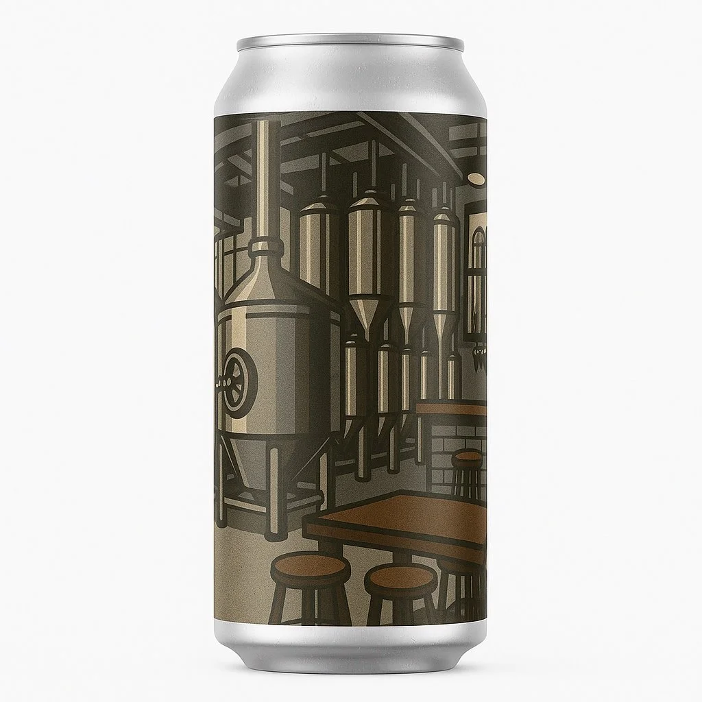
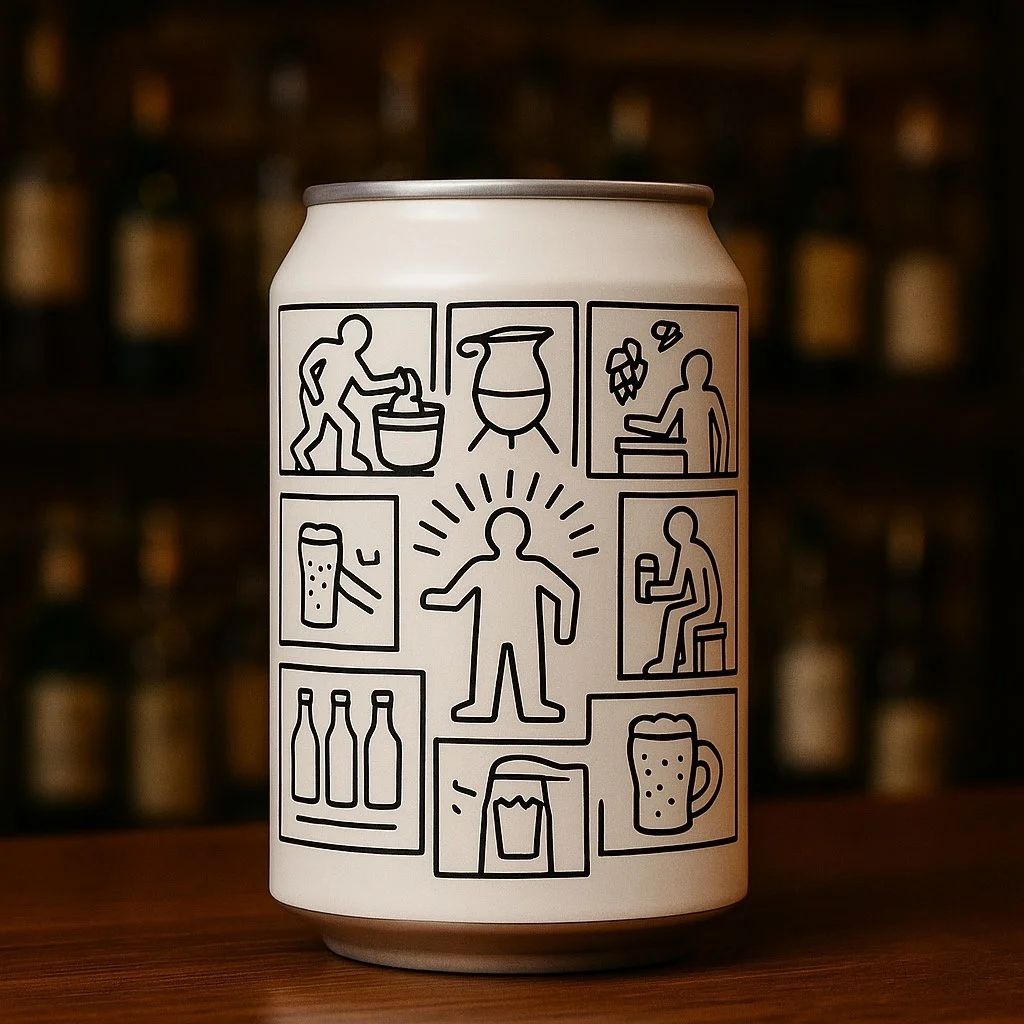
After restarting, things clicked. I created a clean hop cone. Then a can design featuring the brewery itself — rendered in bold outlines and muted shading, a nod to Roy Lichtenstein’s architectural style. I followed that with a 3x3 grid of tankard glasses in rotating colours. The Pop Art repetition worked. I explored fruit compositions, Warhol-style grids, and even Keith Haring–inspired outlines showing the brewing process.

Without relying on words, the visuals became stronger. Rhythm replaced slogans. Colour did the storytelling. The can didn’t need to say Boom anymore. It looked like it meant it.
I didn’t get the design I first imagined, but I got something better — a set of cans that speak in shape, tone, and attitude. Along the way, I used ChatGPT to help me reflect, write, and make sense of the process.
And yes, one of the designs probably still has a cherry hiding somewhere.